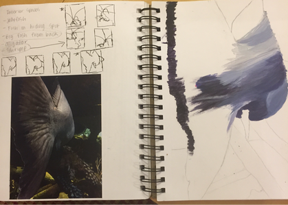
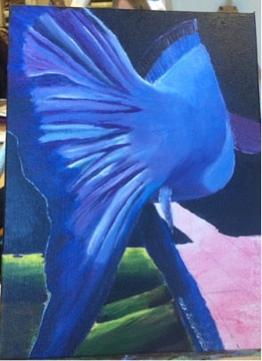
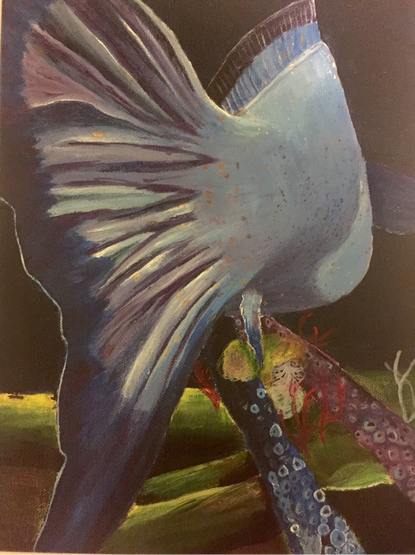
This projects assignment was to use any medium to show interior spaces. To find ideas for this, I scrolled through my camera roll on my phone. The picture that I ended up using was a picture of a fish. The fish's fin is facing towards the viewer as it swims away. I love this picture because it is for a different angle of a fish than is normal. I decided to make this fish primarily blues and purples, instead of gray and blue. The purple was able to nicely contrast with the bright green mossy ground. I am very pleased with how the shape of the fish turned out. Originally I hated this piece. I felt that you couldn't see that the fish was turning and couldn't tell that the image was a fish without being told. I decided to add the dark copper spots on the fish and loved it. I feel that the spots add so much to the perspective of the fish and help the show the curve of the fish's body. I think I grew as an artist during this piece because I am learning more and more about balancing colors. Also, shifting from using oils from the past two projects, it definitely took some adjusting to blending the colors....I may be team oils now. If I were to do this project again, I would adjust the size of the top fin of the fish. Maybe in the future I will also go back to blend the shadows more in the fin.
