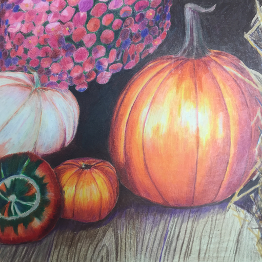
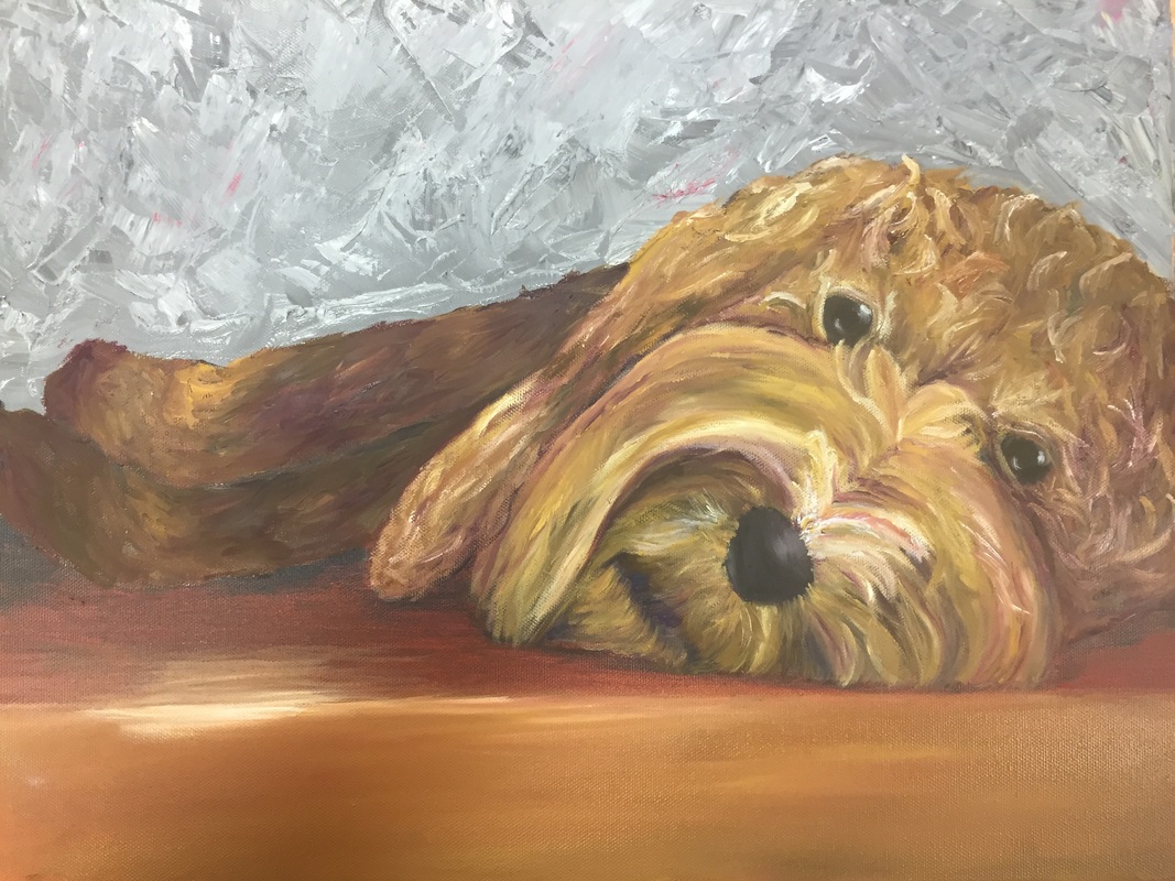
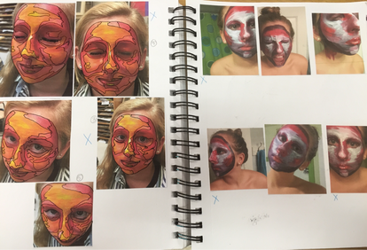
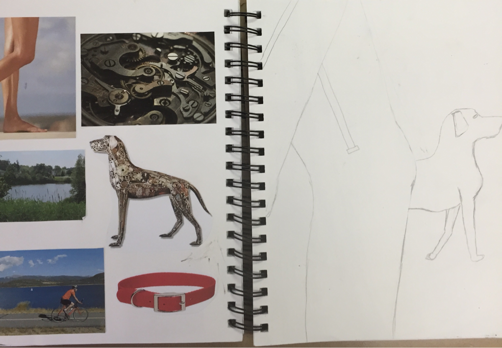
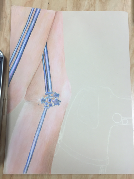
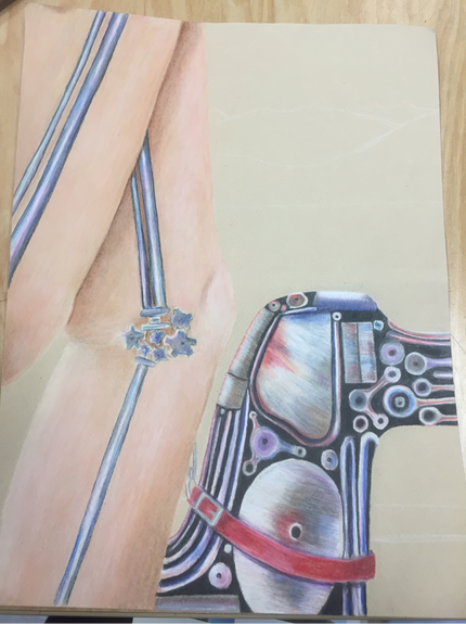
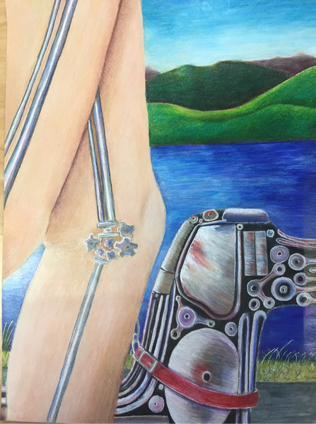
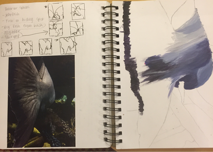
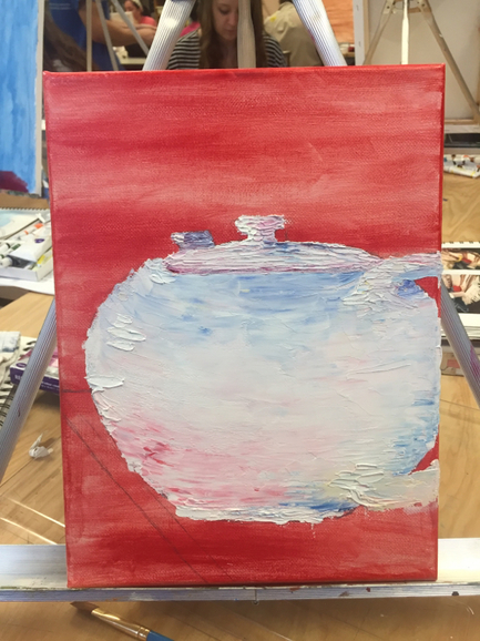
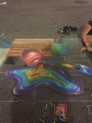
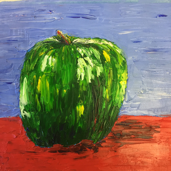
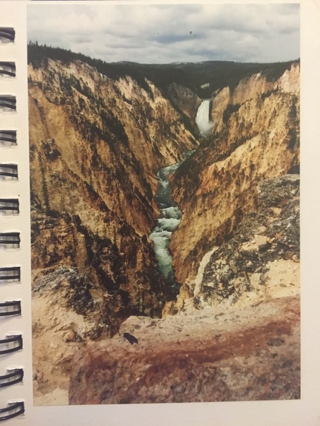
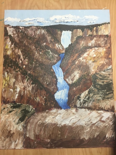
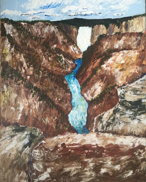
This project assignment was a landscape. The picture was taken at yellow stone national park. The piece is in acrylic paint. When I started this project, my main objective was to capture the texture of the rocks. I had originally thought of doing a water color piece with pen. I ended up doing the piece with acrylic and a palette knife. I started the piece off with a red backwash. I chose red because of the red in the foreground rocks. When using the palette knife, I tried to focus on following the lines down towards the water. One of the things I learned when doing this piece was the while using a palette knife, you can just lay down colors and blend on the canvas. At first I had a hard time differentiating between the different ridges in the mountains. I ended up taking a deep green and using the trees on the top of the mountain to show the different ridges. My darkest color in this piece is purple. I used the purple in the shadows behind the closest rock and right of the edges of the waterfall. I painted the waterfall first in just blue and white. I then decided to go back and add some yellow in. I was most apprehensive about the clouds, which of course I saved for last. I ended up just trying to lay down black, blue and white in the clouds. The closest clouds are pure white. I overall am really pleased with this piece. I love the flow of the piece and am really happy with the texture. One thing that I think I might want to do is to go back on the closest rock and put another layer of white on top of the red. Also the rock on the right behind the closes rock looks a little funky so maybe fix that as well.
0 Comments
The prisma color contest was to draw the picture above with prisms. I cropped the picture into a square. The top picture is my drawing!
This project assignment was a pet portrait. I did a portrait of my puppy, Cooper. I used oils. To start off the piece, I did a red acrylic backwash. Then I painted the background and the wood floor. I then started laying the fur by putting the darkest color down and then putting the next lightest color on top. I ended up adding purple into the fur to add depth. I struggled to get the shape of his face right. I think that his nose and eyes are too small in proportion to his head. Overall, this is not my favorite piece. I feel that the dog's fur is too yellow. Also I do not think that the eyes look as real as I had hoped. If I were to do this again, I would have added more texture into the wood. Also I would have taken more time to get the right shape of his face and head.
Art4/AP Art class went on a field trip to the NC State School of Design. During the field trip, we did an interactive lesson on how to come up with design ideas. For this, our class was split up into five group and were each given a prompt. As group five, our prompt was that we were stuck in a foreign country in which none of the members of our group knew how to speak the language. We were on a mountain and our car was broken down. We could see a town below but it was too far to walk to. Our group chose to be stuck in Germany. We also figured that being in the mountains, there would be snow. Our object that we designed to help us to safety was a sled (as a part of the activity we also had to make a model of the invention with some basic materials). To make the sled, we used suitcases that we assumed that we would have in the car. we would empty out and open two suitcases. Then we would remove two car doors from the car and put them in front of the suitcases. The car doors served as protection in case we hit an objects. Also the doors would help us steer the sled and control the speed of the car to some extent. If we pushed the car doors out, the sled would slow down; if we pulled them in, the sled would speed up. As far as steering was concerned, if we pushed just the right door out, the sled would move left and vise versa. All of the parts of the sled would be connected by jumper cables.
This field trip was very fun and I also learned a lot. One of the main things I took away from this activity was not to fall in love with your first idea, something that I tend to do a lot. Continuing the brainstorming process can lead to some even better ideas. Also, it is very important to write down every possible idea you have, no matter how crazy the idea may be. This is important because even if the idea in its whole is not practical, one aspect of the idea may be and you may be able to use that aspect to improve another idea. The project assignment was a self portrait. Naturally after receiving the assignment, I went to pinterest. I found many ideas. My original idea was to paint my face with acrylic paint, and then paint the picture of my painted face. I wanted to focus on the contouring of my face, exaggerating the highlights and darks of my face. My lovely sketches of faces outlined the two color schemes. The first pictures of my face painted were the one and only, Lizzie Davis. The color scheme was yellow, pinks, and oranges. Later at home I painted my own face with purple, whites, and reds. Mrs. Rossi then forced me to then come up with a second idea. I started doodling with the idea of blocking in color with triangles. I fell in love with the idea. I ended up using the same photo from my original idea for the triangles. To start the piece, I primed the canvas with a green backwash to contrast the red and purples. I really like this piece because of the how the triangles are able to show the curve and structure of my face. I think that I was able to match my skin tone very well on my chest, neck and ear. One thing that I would fix is the collarbone. I think the right collarbone is a little too long and a little too high up. Overall I am extremely pleased with how this piece ended up. I particularly like my addition of my shark earring:)
The piece symbolizes the mask that people wear, covering their true selves. Masks can be used to protect people from getting hurt in a relationship. And not necessarily a romantic relationship, but any relationship with another person. Many times it is hard for me to express how I truly feel when it comes to "bad emotions". Bad emotions being sadness, anger, or fear. It is at the time that I am experiencing these emotions to remember being vulnerable in a relationship is not bad. The project assignment for this piece was nature turns mechanical. My first idea was to do a mechanical soldier. I loved the design of the breast plate and hoped to be able to replicate the design but when I was trying it on my draft, I couldn't capture the metal the way I wanted. Scraping that idea, I ran with my next idea. Originally the picture was just a close up view of legs walking. The legs have a mechanical interior as if you were seeing into the inner mechanisms of the leg. I then decided to add a mechanical dog next to the legs. The legs were a lot harder than I had initially anticipated. I started off just coloring in the leg with the skin color prisma and got frustrated when the lines wouldn't blend away. Michelle, the girl who sits next to me, advised me to use small circular motions when blending and blocking color; this made a world of a difference. I like how the dog turned out, especially the red in the ear of the dog. I struggled to make the dogs stand out in the foreground. Because of the black in between the bars, the black pulled the dog back into the middle ground when the dog is suppose to be walking beside the person.The grass in the middle ground was hard because I didn't want to blend the colors together but I wanted to cover all of the paper. Also, the blades of grass were taller than the edge of the water so it overlapped, but the dark blue over powered the green. To highlight the grass blades, I took a white gel pen and highlighted the taller blades of grass. I also used the white gel pen to accent the highlights in the metal. I purposely made the streaks in the medal while applying the gel pen and prismas to resemble stainless steel. I love the hills in the background because I feel like the green ties in with the middle ground grass really well. I saved the sky for last thinking it would be relatively easy, however it was arguably the second hardest part of the piece (the first most definitely being the skin). I think I did achieve my goal though of blending the colors smoothly. If I were to do this project again, I would draw the metal bars in the legs with a ruler. I tend to show some characteristics of being a perfectionist and all I see when I look at the bars is that the lines aren't straight. Also, I would work from the background to the foreground because I feel I could've gotten cleaner lines with the legs and dog. Overall I am very happy with this piece because I feel that I was able to achieve bright and bold colors that I have never been able to achieve with prismas before.
This projects assignment was to use any medium to show interior spaces. To find ideas for this, I scrolled through my camera roll on my phone. The picture that I ended up using was a picture of a fish. The fish's fin is facing towards the viewer as it swims away. I love this picture because it is for a different angle of a fish than is normal. I decided to make this fish primarily blues and purples, instead of gray and blue. The purple was able to nicely contrast with the bright green mossy ground. I am very pleased with how the shape of the fish turned out. Originally I hated this piece. I felt that you couldn't see that the fish was turning and couldn't tell that the image was a fish without being told. I decided to add the dark copper spots on the fish and loved it. I feel that the spots add so much to the perspective of the fish and help the show the curve of the fish's body. I think I grew as an artist during this piece because I am learning more and more about balancing colors. Also, shifting from using oils from the past two projects, it definitely took some adjusting to blending the colors....I may be team oils now. If I were to do this project again, I would adjust the size of the top fin of the fish. Maybe in the future I will also go back to blend the shadows more in the fin.
This projects assignment was simple objects. I decided to paint teapots. The medium I used was oil paints. I started out using a pallete knife with this project. I struggle with adding darks to the white teapot because I felt that it compromised the integrity of the white. In the end, I feel I was able to incorporate those darks. I really enjoyed the composition of this piece. I feel that the angle of which the first teapot is represented and the repetition shown in the teapots in the background help tie the entire piece together. I am very proud of my use of colors in this piece. I continue to grow in expanding my application colors, instead of strictly sticking to the obvious colors seen in the reference picture. Overall, I am very happy with this piece and have grown to like oil paints slightly more than when I started with this piece. |
|